Reference card
Documentation
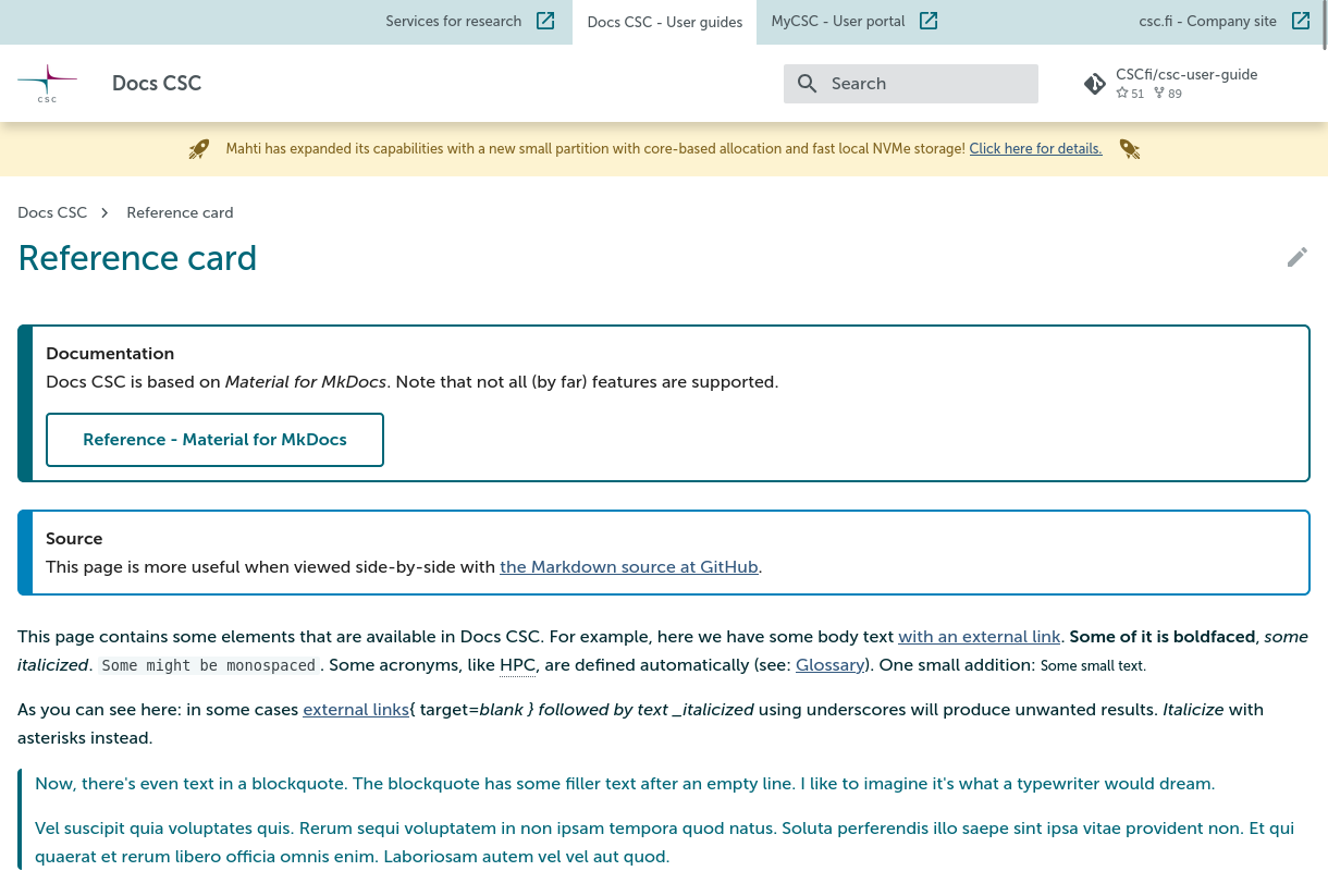
Docs CSC is based on Material for MkDocs. Note that some features might not be available on Docs CSC (see below).
Pro tip
As the reference documentation of Material for MkDocs is itself implemented using Material for MkDocs, you can browse it for ideas on how to present your documentation on Docs CSC. To view the Markdown source for a particular page of the documentation, click the "view" icon in the top-right corner of a page (the same goes for Docs CSC, except here we currently only have the "edit" icon ). Additionally, you can, for example
- Search for available icons and emojis
- See how they present the result of using a feature or a piece of configuration. For example, a tabbed comparison of the result when changing the
alignproperty for images (click on to see the source) - Get an idea whether some feature is available on Docs CSC by comparing the current configuration in mkdocs.yml with the documentation on enabling a feature
This page contains some elements that are available in Docs CSC. For example, here we have some
body text with an external link. Some of it is
boldfaced, some italicized. Some might be monospaced. Some acronyms, like HPC, are
defined automatically (see: Glossary). One small addition: Some small text.
As you can see here: in some cases external links{ target=blank } followed by text _italicized using underscores will produce unwanted results. Italicize with asterisks instead.
Now, there's even text in a blockquote. The blockquote has some filler text after an empty line. I like to imagine it's what a typewriter would dream.
Vel suscipit quia voluptates quis. Rerum sequi voluptatem in non ipsam tempora quod natus. Soluta perferendis illo saepe sint ipsa vitae provident non. Et qui quaerat et rerum libero officia omnis enim. Laboriosam autem vel vel aut quod.
Here's a reference to a footnote:1
And there's a reference to a second footnote:2
Then—as a rule—a horizontal rule:
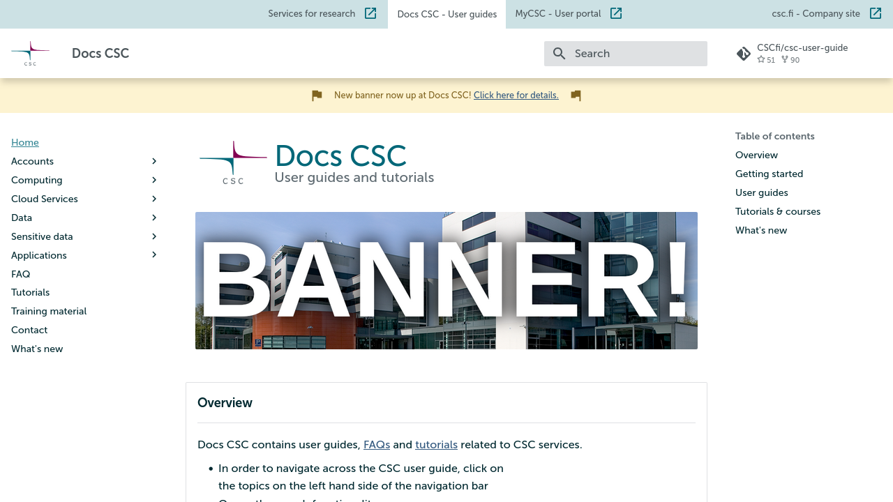
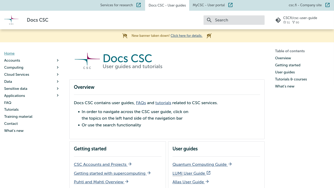
Banners
The front page can be fitted with a banner to promote a course for example. The banner is controlled via the extra.landing_banner mapping in mkdocs.yml. The image file named in extra.landing_banner.image should be placed in the docs-files Allas bucket, under banners/.
path:Don't touch!image:The image filename in docs-files/banners/ Allas bucket.title:Shown, e.g. as a tooltip when pointing the image with a mouse cursor.link:The URL for more information, an enrolment page for a course etc.description:A short description of the banner rendered as alternative text. Provided mainly for accessibility, i.e. screen readers.visible:Set totrueorfalseto show or hide the banner.
extra:
  # ...
  landing_banner:
    path: https://a3s.fi/docs-files/banners/ # Put the image file in this bucket; Don't touch this value.
    image: example-banner.png
    title: Example banner now up on landing page
    link: https://example.org/courses/example-course/
    description: |-
      Banner for upcoming example course.
      Second line for example description.
    visible: true
Glossary
There is a glossary of HPC-related acronyms that get highlighted automatically. For example: CPU, GPU, QPU, etc. The acronyms are defined in the markdown file csc-overrides/assets/snippets/glossaries/hpc.md. More acronyms (case-sensitive) can be added there or into another markdown file, like so:
The glossary is also viewable as a page at docs.csc.fi/glossary.
Headings
The heading for Headings is a heading of a heading level 2. Remember to only use one heading level 1 heading on your page and to keep the heading hierarchy intact. So no skipping levels.
### This is a heading level 3 heading

That one's a level 3. Here is some text under it.


#### Now for a level 4 heading

Some text _four_ it here.


##### Level 5 heading: `now with added monospace`

No text this time.


###### Level 6

More text coming up next in Text.
This is a heading level 3 heading
That one's a level 3. Here is some text under it.
Now for a level 4 heading
Some text four it here.
Level 5 heading: now with added monospace
No text this time.
Level 6
More text coming up next in Text.
Text
Lorem ipsum dolor sit amet, consectetur adipiscing elit. Vestibulum nulla ex, elementum ultrices tempor quis, commodo sit amet quam. Sed accumsan placerat nunc. Suspendisse elementum augue et est tempor lacinia. Pellentesque vel ante id nunc luctus euismod id non est. Vivamus porttitor dui et porta maximus. Sed quis orci finibus, feugiat orci vitae, luctus nisl. Praesent lorem turpis, tristique id lacus sed, sollicitudin ultricies velit. In maximus ante massa, in ullamcorper eros IaaS fermentum in. Nulla condimentum urna sit amet leo scelerisque, et iaculis odio iaculis. Donec quis tortor non metus tincidunt placerat. Curabitur rhoncus libero ut augue scelerisque varius. Nunc bibendum sit amet nisi in varius. Nullam eu eros elementum, pellentesque nisl non, laoreet felis. Ut et risus enim. Proin tempor tellus eu commodo blandit. Interdum et malesuada fames ac ante ipsum primis in faucibus.
Nam erat dui, ullamcorper sit amet erat nec, interdum posuere diam. Nam aliquet gravida hendrerit. Sed erat justo, feugiat sollicitudin scelerisque id, luctus sit amet velit. Sed suscipit at nisi eu ornare. Nam in mauris ex. In ut sagittis nibh, eleifend pharetra tortor PaaS. Integer sapien tortor, ullamcorper ac diam ut, vehicula mattis augue. Pellentesque a enim eget est ornare ullamcorper vitae nec mi. Quisque quis congue augue, eu aliquam tortor. In risus lectus, pharetra eu fermentum non, gravida volutpat magna. Morbi in congue erat.
Donec a est quis nulla scelerisque cursus ut vitae ligula. In risus felis, finibus et tortor eu, volutpat efficitur turpis. Praesent vitae vulputate dolor, at posuere urna. Aenean ullamcorper orci sit amet purus tincidunt, id vehicula lectus aliquet. Ut auctor dapibus magna at hendrerit. Nam lobortis convallis lacus blandit tempus. Proin et ex ut dolor vehicula suscipit a vitae nisi. Nam feugiat accumsan purus, sit amet efficitur felis. Integer vitae enim eu massa placerat faucibus eget vel ipsum. Nullam tincidunt, sapien at blandit pulvinar, lacus mauris finibus turpis, sit amet suscipit magna tortor sit amet tortor. Ut tortor neque, convallis non volutpat a, pharetra nec sapien. In in congue nisl, quis egestas nisi. Fusce ut orci luctus sem tincidunt malesuada. Pellentesque id consequat tortor, sed egestas metus. Phasellus sed venenatis purus, in dapibus magna SaaS. Cras interdum ornare risus, a condimentum magna lacinia eget. Morbi dapibus elementum massa et ultrices. Nulla vel lobortis ex. Ut egestas posuere odio, sit amet mollis lacus placerat at. Quisque ut laoreet purus. Etiam id consectetur ipsum. Phasellus lectus ante, scelerisque in nunc a, vulputate efficitur nunc. Suspendisse nec nisi ut massa mattis interdum vel eget orci. Aenean porttitor erat nulla. Vivamus ac urna et orci faucibus pharetra. Integer in urna tincidunt, tempor turpis nec PaaS, malesuada justo. Vivamus ornare sem ut mi ultricies fringilla. Ut in semper diam, vitae porta neque. Donec maximus tellus et orci bibendum hendrerit. Ut ut consectetur magna. Aliquam vel rhoncus elit. Praesent vitae tincidunt urna, et pulvinar orci. Phasellus auctor augue eu sagittis fermentum. Nullam tempus malesuada augue, nec volutpat mi sodales quis. Vivamus mollis commodo eros sed porta. Praesent ultrices elementum metus, sit amet fringilla turpis luctus vitae. Mauris turpis felis, molestie eget ipsum ac, fringilla euismod risus. Phasellus at arcu ante. Cras eu enim dui. Quisque eu hendrerit magna. Donec ac elit laoreet, mattis tortor et, feugiat nisl. Duis maximus ultrices elit, quis hendrerit orci.
Lists
### Unordered list

Here is an unordered list:

- It has an item
- Another item
- And yet another item


### Ordered list

Let's make an ordered list:

1. An item on a list
1. Another item
1. Even a third item
Unordered list
Here is an unordered list:
- It has an item
- Another item
- And yet another item
Ordered list
Let's make an ordered list:
- An item on a list
- Another item
- Even a third item
Source code / output listing
```python hl_lines="2 3"
# Here is a box with some syntax highlighted Python

from somewhere import some_code


NUMBER = 42
LIST = [1, 2, 'three']


class PythonClass:
    def __init__(self) -> None:
        self.__property = 'A string property'

    @property
    def property(self) -> str:
        return self.__property

    @staticmethod
    def method(parameter: int = 1) -> list[None]:
        return [None] * (parameter + NUMBER)

def main():
    string = f'Length of list is {len(LIST)}.'
    print(string)
```
# Here is a box with some syntax highlighted Python

from somewhere import some_code


NUMBER = 42
LIST = [1, 2, 'three']


class PythonClass:
    def __init__(self) -> None:
        self.__property = 'A string property'

    @property
    def property(self) -> str:
        return self.__property

    @staticmethod
    def method(parameter: int = 1) -> list[None]:
        return [None] * (parameter + NUMBER)

def main():
    string = f'Length of list is {len(LIST)}.'
    print(string)
Notice the line highlighting (on lines 2 and 3). Additionally, the code boxes can have a title:
```javascript title="looong_comment.js"
// Here's a JavaScript comment with a loooooooooooooooooooooooooooooooong line. You know, for testing purposes. Tell you what, let's make it just a bit longer still.
```
Diff works too:
Remember to leave an empty line after the ``` in a source code box. Failing to do so can leave
any immediately following text as "loose", i.e., outside of an HTML paragraph (<p>).
Languages
See Languages at pygments.org for a complete list of supported languages. To highlight a few useful ones here:
-
Lexer for (ba|k|z|)sh Slurm scripts.
Short names: slurm, sbatch
-
Lexer for Bash shell sessions, i.e. command lines, including a prompt, interspersed with output.
Short names: console, shell-session
-
Simple lexer that highlights everything as Token.Generic.Output.
Short names: output
-
Text:
"Null" lexer, doesn’t highlight anything.
Short names: text
Tables
| This | Table | Has | Five | Columns |
|-|-|-|-|-|
| and | | | | |
| | it | | | |
| | | has | | |
| | | | five | |
| | | | | rows |
| This | Table | Has | Five | Columns |
|---|---|---|---|---|
| and | ||||
| it | ||||
| has | ||||
| five | ||||
| rows |
Admonitions
The fallback style
!!! note "Here we have an important announcement"

    Make sure you read this note inside this very important-looking
    box as this is the fallback for unknown type qualifiers.

    Type qualifier can be anything, as long as it's not
    `default`,
    `default-label`,
    `info`,
    `info-label`,
    `warning`,
    `warning-label`,
    `error`,
    `error-label`,
    `success`,
    `success-label`,
    `training` or
    `training-label`.
    Perhaps a suitable one would just simply be: `note`.

!!! note ""

    Title may be removed with `note ""`.
Here we have an important announcement
Make sure you read this note inside this very important-looking box as this is the fallback for unknown type qualifiers.
Type qualifier can be anything, as long as it's not
default,
default-label,
info,
info-label,
warning,
warning-label,
error,
error-label,
success,
success-label,
training or
training-label.
Perhaps a suitable one would just simply be: note.
Title may be removed with note "".
Styles available with type qualifiers
Alert style
!!! default "Nothing special"

    Type qualifier: `default`.

    !!! default-label

        This isn't the actual default (fallback) admonition for legacy reasons.

!!! info "Information available"

    Type qualifier: `info`

!!! success "You've got it!"

    Type qualifier: `success`

!!! warning "You're on thin ice!"

    Type qualifier: `warning`

!!! error "Oopsie!"

    Type qualifier: `error`
Nothing special
Type qualifier: default.
Default-label
This isn't the actual default (fallback) admonition for legacy reasons.
Information available
Type qualifier: info
You've got it!
Type qualifier: success
You're on thin ice!
Type qualifier: warning
Oopsie!
Type qualifier: error
Collapsible
???+ default "Collapsible default"

    Some content shown by default (click on title to hide).

??? default "Collapsible default (click to reveal content)"

    Some content hidden by default.

??? info "Collapsible info (click to reveal content)"

    Some content hidden by default.

??? success "Collapsible success (click to reveal content)"

    Some content hidden by default.

??? warning "Collapsible warning (click to reveal content)"

    Some content hidden by default.

??? error "Collapsible error (click to reveal content)"

    Some content hidden by default.
Collapsible default
Some content shown by default (click on title to hide).
Collapsible default (click to reveal content)
Some content hidden by default.
Collapsible info (click to reveal content)
Some content hidden by default.
Collapsible success (click to reveal content)
Some content hidden by default.
Collapsible warning (click to reveal content)
Some content hidden by default.
Collapsible error (click to reveal content)
Some content hidden by default.
With the title removed
!!! default ""

    Type qualifier: `default ""`

!!! info ""

    Type qualifier: `info ""`

!!! success ""

    Type qualifier: `success ""`

!!! warning ""

    Type qualifier: `warning ""`

!!! error ""

    Type qualifier: `error ""`
Type qualifier: default ""
Type qualifier: info ""
Type qualifier: success ""
Type qualifier: warning ""
Type qualifier: error ""
Label style
!!! default-label

    Label type available with type qualifier `default-label`.

!!! info-label

    Label type available with type qualifier `info-label`.

!!! success-label

    Label type available with type qualifier `success-label`.

!!! warning-label

    Label type available with type qualifier `warning-label`.

!!! error-label

    Label type available with type qualifier `error-label`.
Default-label
Label type available with type qualifier default-label.
Info-label
Label type available with type qualifier info-label.
Success-label
Label type available with type qualifier success-label.
Warning-label
Label type available with type qualifier warning-label.
Error-label
Label type available with type qualifier error-label.
Special admonition to denote external training material
External training material available
Type qualifier: training
Variations
???+ training "Collapsible training"

    Some content shown by default (click on title to hide).

??? training "Collapsible training (click to reveal content)"

    Some content hidden by default.
Collapsible training
Some content shown by default (click on title to hide).
Collapsible training (click to reveal content)
Some content hidden by default.
Type qualifier: training ""
Training-label
Label type available with type qualifier training-label.
Inline admonitions
For inline admonitions, you first define the admonition as either
`inline` or `inline end`. Then, you define the content.

!!! warning inline "Hold on!"

    This script might give unexpected results!

    `warning inline "Hold on!"`

!!! info inline end ""

    Then again, it might not.

    `info inline end`


```bash
a="unexpected"
b="results"
if [ $RANDOM -eq $RANDOM ];
then
    echo $a $b
fi
```
For inline admonitions, you first define the admonition as either inline or inline end. Then,
you define the content.
Hold on!
This script might give unexpected results!
warning inline "Hold on!"
Then again, it might not.
info inline end
Try adding a , like on the last line of the example above, if inline admonitions give you trouble.
Images
Images can be added by just using the Markdown syntax for an image
or with caption by wrapping it in some HTML tags like so
<figure markdown="span">

<figcaption>Here's an image of the Reference card with an image of the Reference card with...</figcaption>
</figure>

Embedded videos
At the moment, to avoid setting cookies, embedded videos are rendered only as an image with a link to the video in question. For example: Behold! Here is a video of a horse kicking a tree, farting on some dogs, and then running away:
<iframe
    width="400"
    height="300"
    srcdoc="https://www.youtube.com/embed/KCzwyFHSMdY"
    title="Horse kicks tree, farts on dogs then runs away."
    frameborder="0"
    allow="accelerometer; autoplay; clipboard-write; encrypted-media; gyroscope; picture-in-picture"
    allowfullscreen
></iframe>
Animations
If you don't need sound (or controls), you can use animations as an alternative for embedded videos. They are used just like static images. Both .gif and .png files work.
Diagrams
Mermaid
Documented here: https://mermaid.js.org/intro/, but for example a fenced block like this:
```mermaid
flowchart TD
    A{"`Does your
        reference card
        include a _Mermaid_
        diagram?`"}
    B(Yes, it does.)
    C([Good])

    A-->|Yes| C
    A -->|No| B
    B --> |"`What?! No, you
             can't just... Oh.`"| C
```
produces a flowchart like that:
flowchart TD
    A{"`Does your
        reference card
        include a _Mermaid_
        diagram?`"}
    B(Yes, it does.)
    C([Good])

    A-->|Yes| C
    A -->|No| B
    B --> |"`What?! No, you
             can't just... Oh.`"| C
Draw.io
Diagrams (including a toolbar) from draw.io can be embedded as iframes by selecting File -> Embed -> IFrame.... With line breaks added for illustration, the resulting piece of HTML could look something like this:
<iframe
  frameborder="0"
  style="width: 100%;
         height: 301px;"
  src="https://viewer.diagrams.net/?tags=blahblahblahblah%blah
       blahblahblah%blahblah%blah%blahblahblahblah%blahblah"
></iframe>
The src attribute needs to be renamed to srcdoc:
The size can be controlled by changing the value of the style attribute. Note the units: % for width and px for height. Here's an example with a width of 100 percent and a height of 500 pixels:
Buttons
Markdown links may have the classes .md-button and .md-button--primary added to them to produce links that look like buttons. In the following example, the buttons have their corresponding headings/anchors (#button for ### Button and #primary-button for ### Primary button) as the link target.
### Button

[Button](#button){ .md-button }


### Primary button

[Primary](#primary-button){ .md-button .md-button--primary }
Tabbed content
=== "First tab"
    Content can be divided into tabs. The first one is visible by default.

    !!! default ""
        There can be any content, like this admonition, under tabs.

=== "Second tab"
    | Tables | work | fine | too |
    |-|-|-|-|
    | just  | as | an | example |

=== "And so on..."
    It can get quite messy:

    !!! warning ""

        === "Probably not what you want"
            You can even have nested tabs under admonition under tabs.

        === "But possible, nonetheless"
            I would recommend against it, though.
Content can be divided into tabs. The first one is visible by default.
There can be any content, like this admonition, under tabs.
| Tables | work | fine | too |
|---|---|---|---|
| just | as | an | example |
It can get quite messy:
You can even have nested tabs under admonition under tabs.
I would recommend against it, though.
Snippets
Files under csc-overrides/assets/snippets/ may be added as snippets on the current page.
Suppose we have two Markdown files, a.md and b.md with the content
and
The file ref/a.md (relative to the base path above) added as a snippet with
would look like this:
Yes, this is a.md.
Adding ref/a.md and ref/b.md using
would look like this:
Yes, this is a.md.
Hello from b.md!
Snippets also work from inside the source code boxes. For example
would produce
More examples (untested in Docs CSC) can be found in PyMdown Extensions Documentation.
Hiding the sidebars
The sidebars on a particular page can be hidden by adding a hide property to the YAML front matter in the page Markdown source.
Here's a preview screenshot for each case:
Make sure that the breadcrumbs navigation at the top of the page is working correctly if hiding the navigation sidebar!
The table of contents may also be inserted arbitrarily on the page by simply adding the marker [TOC] in the Markdown source:
Grids
The Grids feature from Material for MkDocs is available in Docs CSC.
<div class="grid cards" markdown>

- :material-view-grid:{ .lg .middle } **Grids on Docs CSC**

    ---

    Here we go!

- :material-view-grid-plus:{ .lg .middle } **Another one**

    ---

    Yay!

</div>
-
Grids on Docs CSC
Here we go!
-
Another one
Yay!
With colors
<div class="grid cards" markdown>

- :material-dna:{ .lg .middle } **Accent**
  { .csc-grid-card-accent }

    ---

    Science!

- :material-information:{ .lg .middle } **Info**
  { .csc-grid-card-info }

    ---

    This.

- :material-check-circle:{ .lg .middle } **Success**
  { .csc-grid-card-success }

    ---

    Do!

- :material-alert:{ .lg .middle } **Warning**
  { .csc-grid-card-warning }

    ---

    Don't!

- :material-close-circle:{ .lg .middle } **Error**
  { .csc-grid-card-error }

    ---

    Why?!

</div>
-
Accent
Science!
-
Info
This.
-
Success
Do!
-
Warning
Don't!
-
Error
Why?!